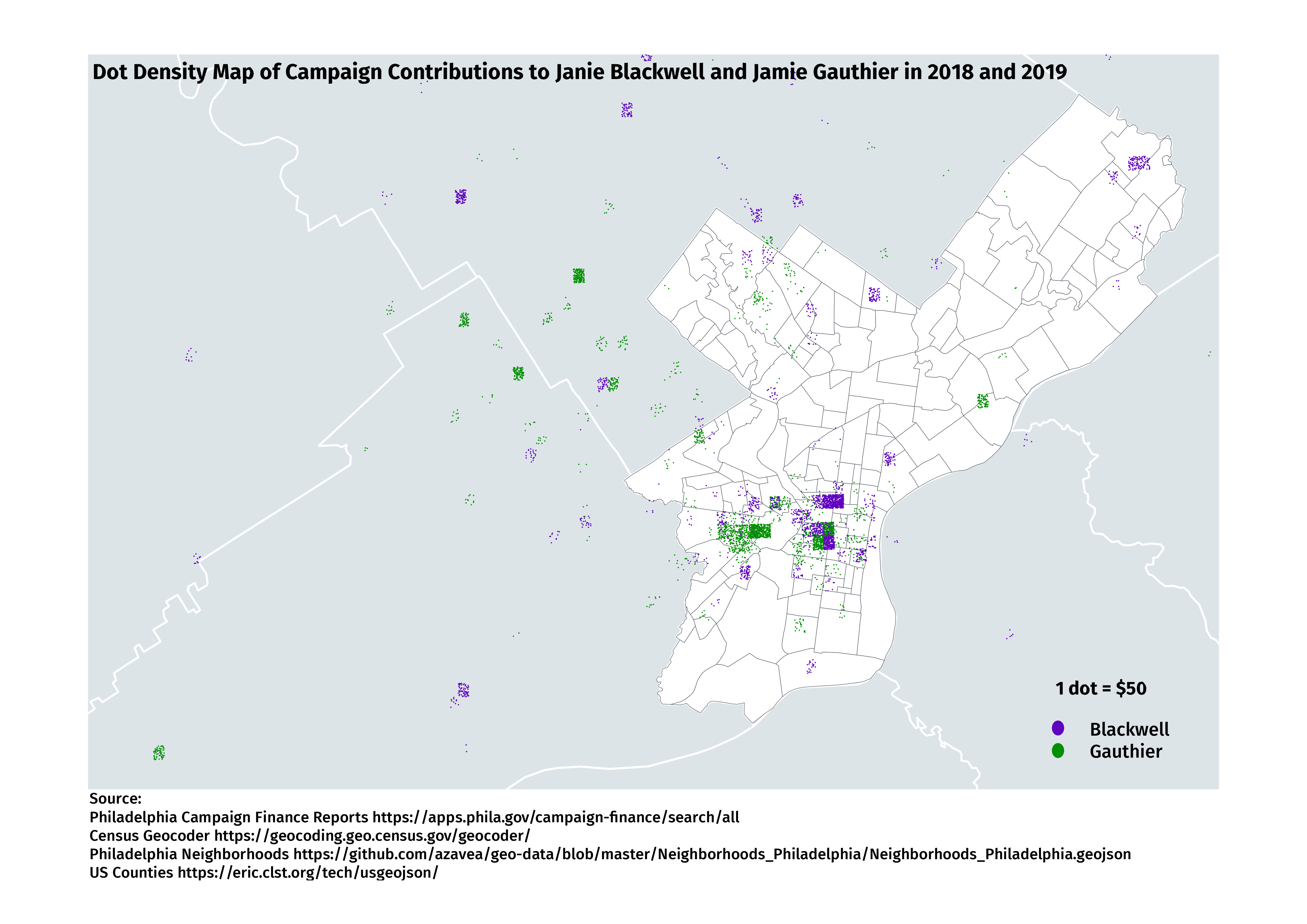
After creating a small analysis of campaign finance data for the Blackwell and Gauthier campaigns, I thought it would be interesting to see on a map where financial contributions come from.
I extended my script to geocode all of the addresses of donors and output them to a CSV file. I wrote another script to read this CSV file and write another file with a point per $50, with the location randomized within its square on a grid.
I then loaded this file into QGIS and overlayed it on top of Philadelphia Neighboorhood outlines and county outlines.
Caveats
- This is a very quick analysis. Some entries were dropped because of geocoding errors, and I didn’t follow up to see if they were big donations or small donations.
- As noted in my earlier analysis, the donor reported addresses aren’t always useful for determining residency (but they are probably good enough in most cases.)
- This misses a whole lot of donations that came from outside the map. I didn’t even spend the time to find out how much, but it’s probably quite a bit. See the list of donors to get a sense of how much came from other cities or states.
As always, questions, comments, etc are welcome at sharp@sharphall.org.